Why you need Seasonal Colour Analysis

“Why does this colour look good on her but not on me?”

Two women wearing the same maroon.

One glows.

One looks dull.

The right colours can make your skin look brighter, eyes clearer and features more defined.

Ever wondered why your friend’s favourite colour doesn’t work for you?

It’s not about fair or dark skin.

It’s about your personal colour season.

Do you have clothes in your wardrobe that looked amazing in the shop but wrong on you?
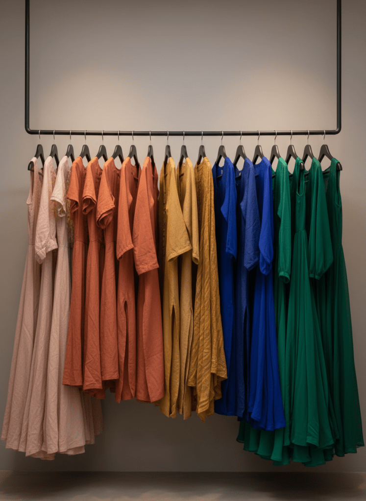
A carefully curated rail of clothing, hangers evenly spaced, displaying colour-coordinated garments specifically chosen for deeper South Asian complexions. Rich emeralds, burnished golds, sapphire blues, spicy terracottas and soft rose beiges are arranged from light to dark. The fabrics include matte cottons, flowing chiffons and subtly textured linens, all facing the same direction on slim, matte black hangers. The rail stands in front of a smooth, warm-grey wall with no other distractions. Soft, even studio lighting from above and slightly to the side creates a gentle gradient on the wall and brings out the textures without harsh shadows. Shot straight-on at eye level with a wide aspect ratio, the composition feels organised and editorial, conveying a polished, professional wardrobe consultation environment in photographic realism.

You bought:

  • mustard
  • neon pink
  • rust orange

You never wore them.

Because they weren’t your colours.

Colour analysis helps you build a wardrobe where everything works together.

Leave a comment